
3 posts tagged with "Responsive Design"

View All Tags

· One min read
Mattias Sander

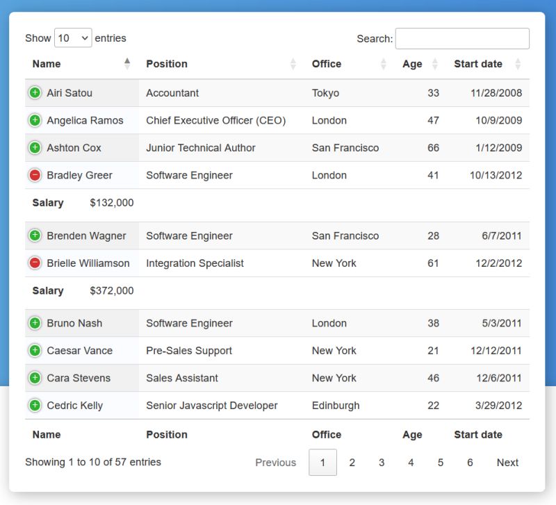
Supercharge your tables in MadCap Flare using the DataTables JavaScript plug-in. As a bonus it makes your tables mobile friendly automatically.

Just add these tags to your template page <head> element:

<link rel="stylesheet" type="text/css" href="//cdn.datatables.net/2.0.1/css/dataTables.dataTables.min.css">

<script type="text/javascript" src="//cdn.datatables.net/2.0.1/js/dataTables.min.js"></script>

<script type="text/javascript">
$(document).ready(function() {
let table = new DataTable('.myTable');
});
</script>

For more information, see https://datatables.net/.

· One min read
Mattias Sander

When working with MadCap Flare, generating responsive HTML output is key for accessibility across various devices. The HTML <picture> element is an essential tool for this purpose, ensuring images in your documentation adapt seamlessly to different screen sizes and resolutions.

Simplified Approach

The <picture> element allows you to define multiple image sources for different viewing conditions. This flexibility is vital for technical documentation, where clarity and readability are paramount.

Usage in Flare

In your Flare project:

<picture>
<source media="(min-width: 800px)" srcset="large-image.jpg"/>
<img src="default-image.jpg" alt="Description"/>
</picture>

This code serves large-image.jpg for screens wider than 800px, with default-image.jpg as a fallback for smaller screens or unsupported browsers.

Benefits

  1. Responsive Design: Tailor images to fit various devices, enhancing user engagement.
  2. Efficiency: Reduce the need for multiple image versions in your Flare project.
  3. Clarity: Ensure images are crisp and clear, regardless of device or screen size.

Incorporating the <picture> element into your MadCap Flare HTML output is a straightforward yet impactful way to elevate your technical documentation. It's an easy step towards creating more responsive, device-friendly content.

· One min read
Mattias Sander

Clamp demo

What is CSS clamp()?

CSS clamp() is a function for responsive font sizing in web design, adjusting font size within specified minimum, preferred, and maximum sizes based on viewport size.

Using clamp() in MadCap Flare

To use clamp() in MadCap Flare for web outputs, update your CSS with a rule like .dynamic-font { font-size: clamp(1rem, 2vw, 3rem); } and apply this class to elements in Flare.

note

clamp() is not applicable to PDFs generated in Flare; adjust font settings for PDFs separately.

Additional Resources